This does not look good!


The first problem is that it cuts your shower in half visually and makes it look smaller.


I don't even begin to guess what these people were thinking! Not only is the tiny border terrible but what the heck is that trim tile doing on the wall? Is it supposed to be a shelf?


This is a great example of a small shower. Look how that horrible border cuts the shower in half. It would've been much better to just leave it off.


The second problem is that they are under-scaled!

Do I follow the line until I get to the prize at the end?

Beautiful shower but why did they ruin it with that ugly diagonal border? It would also look better with frameless glass but I know that stuff is pricey!


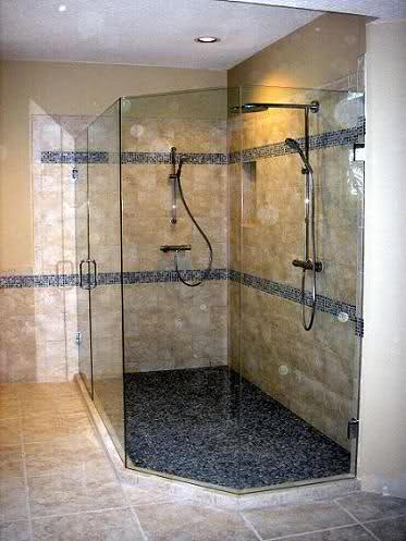
Again, another luxury shower ruined by badly placed border.
So what do you think? Am I just crazy to let this bother me or are you on my side? Well, let me show you some showers that got it right and you tell me which looks better, border or no border.

When in doubt, stick with white! Let the walls be the color in the room. Paint is much cheaper than tile!

This is interesting. I think it works to put the mosaic there because it doesn't break up the shower, however once you have your stuff up there you are probably not going to want to draw attention to your shampoo bottles!

Very nice! But I could live without the white trim piece in the shower. I can see why they did it though because the tile is continuous from wainscot to shower. It would've looked better to leave that piece out of the shower and just stopped it where it intersects with the vertical piece. It is really under-scaled to be in the shower. Also, you can see that they had to cut the tile at the top of the shower. If they would've left off the trim piece they would've had more room for a full tile at the top.

This is a great example of a tile trim piece being the correct scale. It is used to separate a wainscot with the rest of the shower and it works because it is the same tile, just installed differently. This keeps the color constant in the shower and doesn't really break it up visually. Adds interest without making the shower look smaller.

Here is a good example of using accent tile in the correct way. A detailed medallion looks great instead of just running a border around the perimeter.

You could just always do the whole shower in mosaic! What do you think? Too much? If you do have a mosaic shower, make sure and keep the rest of the room very simple.

Love this!


This is a great kid's bathroom!!!


Very pretty marble tile but what do you think about that border running over the shower curb?

This is gorgeous! A great example of using mosaic tile on one wall in shower and then keeping the other walls neutral. I also love how they put the mosaic on the exterior of the shower curb and half wall.

Wow, life's a beach in this bathroom! It makes me a little dizzy. The tile is definitely cool but everything else is just off the mark. The rugs, the towel bar interrupting the tile wall and the vanity mirror.

So am I just too opinionated or do you agree that shower borders are horrible? Let me know what you think, we love getting comments!
~Jessica
120 comments:
We're working on our bathroom now and I agree, borders these days can be tough! We nixed the border and did a solid mosaic shower and I love it.
Great Morgan, I can't wait to see pictures! BTW Olivia is adorable!
I'm a latecomer here, and stumbled upon your blog. I've been trying to select tile for a shower, and have chosen a beautiful quartzite. My contractor took me to some other jobs he had done, but I felt that adding another tile (white subway tile above the same quartzite we selected) or borders/medallions just took away from the beautiful natural stone showers. So I think you are right, 100%, but there are lots of others who are disagree!
Marsha B.
Yeah!! Send us a picture when you are done! It sounds like it's going to be beautiful! Brandy
Uh...no...I don't agree shower borders are horrible. Thanks for the border ideas.
You're an idiot. Having a little accent is much more interesting than just having a bunch of plain square or rectangular tiles.
Def.not.i think one solid tile makes it feel like a cave and the plain old subway tile makes me feel like I need a straight jacket to match the sterile boring environment.
I totally agree! I think the borders usually take away from the look rather than enhance. And as you pointed out, there are other ways to add visual interest.
Finally someone who agrees! I sometimes equate it to a decorative toilet seat- Why??!! in the world would you want to attract attention to a toilet seat! And it cuts the room in 1/2 making the ceiling seem lower!
Thanks for saving me from making a big mistake!
I don't like the border in the middle--as stated, it cuts the room in half. However, if you have a high ceiling, a carefully chose border adds visual interest an a little bling to an otherwise boring, cavernous space. Something not too high contrast and in scale with the other tiles.
You made me laugh!! I'm with you all the way! I'm designing our shower now and have noticed that the borders make me tilt my head, scratch,open and close my eyes. Shake my head and wonder what the accent lines are doing?!? Odd. Just odd. Glad you are so opinionated! Thanks for the laugh!
cool blog piece on the marble quarries.
white marble tile
How beautiful, bright and full of goodness. What a nice gift. The black tiles really set off the great colors
white marble tile
I agree that those borders all look horrible, but I think most of the "all mosaic" showers. Most mosaics I've seen sold are really poorly done - horrible color selections with way too much contrast for widespread use. The showers that were all mosaic just looked completely garrish and distasteful to me, and the high contrast in many of them made it look like the shower was warp-driving through a star field; incredibly way too busy. I would say that any widespread use of 1x1 tiles should be solid color, or a mosaic of very subtle variation so as to add texture and warmth, but not distract the eye.
"When in doubt, stick with white! Let the walls be the color in the room. Paint is much cheaper than tile!"
Agreed, but seriously, if you're going with a white subway and light green border, don't use dark bronze fixtures. Really. Just don't do it.
You have shared really so nice and very beautiful pictures, You are so cool designer, Thanks for sharing with us, Your all pictures will really help us.
Hardwood Floors Calgary
It's such a gorgeous subway bathroom tiles Parker. It adds the value and beauty to your home making, it a unique and beautiful area of your home. Many bathroom remodeling companies offer Bathroom tiles, are also durable and easy to clean then other surfaces that are common in most homes.
The "Beach" tile bathroom is gorgeous; It's like escaping on some fantasy just when going to the bathroom
Hi friends,
I am very surprise contact to smaarthomes why because they have given quality marbles and tiles. Tiles are very clean looking good and superb. Smaarthomes is the best company about fitting dealers and flooring tile dealers.
flooring tile dealers-ultra tech
Totally agree. These borders are a mistake. Especially in a space that you want to look and feel larger....more spacious. Good on you for pointing it out.
I was thinking of a border until I found your page. Thanks.
These are really beautiful frameless shower screens, nowadays people choose shower screens for more durable and could last for a longer of time!
This is an old post but ... I couldn't disagree with you more. There's a history of tile borders and if one is working with a historic house, the borders are perfectly appropriate.
Had to laugh. I just redid our downstairs bathroom in tile and put in the tile border you hate. I love it. The line draws the eye around the space, it runs across the top of the tile wainscot on the back wall and through the floor to ceiling tile in the shower tying them together. The proportions are good and I think it makes the space look less sterile (from another comment) and less blocky and composed of adjacent rectangles of tile. I was amused to see that one example you called "gorgeous! A great example of using mosaic tile on one wall in shower and then keeping the other walls neutral" has a thin border of the mosaic running through the neutral walls and I think those lines are what saves it from being too blocky. The line running from the shower across the floor is also one of the highlights of that bathroom. In answer to "what they were thinking", they clearly have a different aesthetic than you do and it just that: different. It's certainly not less valid or worse.
Thanks for sharing your blog. Want to have great design tiles for your home? http://designtiles.com.au/ Design Tiles Rockdale offers a wide range of tile products, from indoor to outdoor tiles and many more. Visit our website now for more information!
it seems you hate ALL accent strips. I disagree. They shouldn't be in the middle of the shower (cut it in half like you said) or run all over the place as some of your examples do. But the right classy border up higher on the wall and on the simple side (about 6 tiles wide) can be a very nice focal point. Depends on what else is going on in the room.
You state "a detailed medallion looks great", but I think they are distracting and make me wonder why some tiles get framed in the middle of a wall as though it is some sort of "art".
As I said to my sister, "We are different". That doesn't mean some of us are wrong and some of us are right. It just means it's OK to like different things. I personally think the tile borders are fabulous.
Awesome tips and looking good, you can even try Laminate Floors Tampay Bay
, its really well and neat looking.
I have to say that I am so tired of subway tile. And in a bathroom with all walls and shower tiled, my immediate gut reaction was institution. It reminded me of the old hospitals I did my internships in. Sterile!
It's just you....decorative tile trim in showers is just more interesting. I redid my bathroom with a walk in shower with a single border of 4" decorative hand painted Mexican Talavera tile. It turned out gorgeous with the terracotta tile used in the rest of shower and floor. It takes me on vacation every single morning.
If you like a border, then add one. If you don't... If adding a border, my advice is to keep it simple, don't over do it. Always keep in mind the resale .... even if you plan on dying in this home, someday it will have to be sold... even if it's by the surviving family members... Keep the tile relatively neutral, not too overly trendy, and release your personality with the paint and fixtures - the not so permanent things. Personally - a simple border can tie a shower to the rest of the bathroom, the bedroom, and possibly the rest of the house if used in other places. When a border is placed higher on the wall in a small bathroom, it will bring your eyes up - helps you to see the vertical space as well - you won't just see the small footprint. Just my opinion though.
How are the fades with the mosaics created?
They will have to be laid tiny tile by tile. Very laborious.
Nice blog. Keep posting. Looking great and really likeable. Recently I did remodelling of my bathroom for which I purchased the accessories from wholetiles , an online store suggested by my cousin.I am really satisfied with the store for helping me in my need. Thanks for sharing.
Good informative post.
bathroom radiator
heated towel rails
grab rails
heated towel rail
towel rails
Playa del Carmen real estate experts. We are the Premier Playa del Carmen real estate agency with over 10 years of successful and safe investment properties.
Playa Del Carmen real estate
I think most of them look fine (except for the few examples with poor color choices), and Jessica is just a fussy judgmental cunt :)
If you actually look at the tile work in a subway it usually has a line of different tile work with the name of stop. It makes sense to me if using "subway" tiles to have it look like that.
I was beginning to think I was the crazy one for not liking it. But yes, I shudder every time I see some stupid strip of mosaic tile just there. like , oh everyone is doing this, it must be pretty! But no, it just ruins the tile that was there. Like, why in a subway tiled shower do people think that running a line of mosaic will make it look good? No only does it not look good, but it takes away from the classic and clean and non fussy look of subway tile! Thank you, thank you for voicing this! Please people stop doing it!
I AGREE!!! I absolutely hate the stripe in the shower stalls! It's a trend that is long-overdue to die. We're putting in two showers at the new house and NEITHER of them are getting a stripe. Pure, clean, large marble tile on both, zero embellishments, borders, bottle niches, nothing! Cleaner and less grout lines to clean up later and whatever you stick in that stripe today may not be so popular in 20 years. I can't wait to see how many people have to rip out their shower tile jobs when this trend becomes horribly unpopular. Believe me, it will. Remember mirrored walls of the 70s? Anyone like those now? Nope! How about shag carpet? How "red kitchens". Sorry, trends are to risky in a long-term installation like tile.
You share informative post I hope you will share another good post. I read about Bathroom remodeler Austin
Agree, agree, agree! And I have thought this since the trend began, it looks HORRIBLE. I don't like ANY accent stripe... nothing, just plain beautiful tile with no ugly borders or stripes, thank you.
شركات مكافحة الحشرات بالطائف
شركة مكافحة حشرات بالطائف
مكافحة حشرات بالطائف
شركة تنظيف بالطائف
شركة تنظيف بيوت بالطائف
شركة تنظيف شقق بالطائف
شركة تنظيف منازل بالطائف
شركة تنظيف فلل بالطائف
شركة تنظيف ستائر بالبخار بالطائف
شركة غسيل خزانات بالطائف
شركة تنظيف خزانات بالطائف
تنظيف خزانات فى الطائف
شركة نقل عفش بالطائف
نقل اثاث بالطائف
شركة مكافحة حشرات بجدة
شركة رش مبيدات بجدة
شركة تنظيف بجدة
شركة تنظيف الكنب والسجاد بجدة
شركة مكافحة حشرات بمكة
شركة رش مبيدات بمكة
شركة نقل عفش بمكة
شركات تسليك المجارى بالاحساء
افضل شركة تسليك مجارى بالاحساء
تسليك مجارى بالاحساء
افضل شركة تنظيف فى الاحساء
شركة تنظيف بالاحساء
شركة تنظيف شقق بالاحساء
تنظيف منازل بالاحساء
شركة تنظيف منازل بالاحساء
شركة تنظيف منازل فى لاحساء
شركة تنظيف فلل بالاحساء
شركة تنظيف مجالس بالاحساء
شركة تنظيف كنب بالاحساء
تنظيف بالبخار بجدة
شركة غسيل بالبخار بجدة
شركة تنظيف بجدة
تنظيف بجدة
شركات تنظيف بجدة
شركة تنظيف شقق بجدة
شركة تنظيف سجاد وموكيت بجدة
شركة تنظيف فلل بجدة
شركة تنظيف مجالس وكنب بجدة
شركة تنظيف خزانات بجدة
شركة غسيل الخزانات بجدة
شركة عزل خزانات بجدة
شركة تنظيف مكيفات بجدة
شركة نقل عفش بجدة
شركة نقل اثاث بجدة
شركة تخزين اثاث بجدة
شركة تغليف عفش بجدة
شركة مكافحة حشرات بجدة
شركة مكافحة الصراصير بجدة
شركة مكافحة الفئران بجدة
شركة مكافحة العتة بجدة
شركة مكافحة بق الفراش
We’ve been stumbling around the internet and found your here blog along the way.
We love your work! What a great corner of the internet :)
Oh it looks great! I love the color.
terrazzo polishing
terrasso polishing
I really think the application has to look right, and if it does, go for an in-scale, appropriate border.
There is also a practical consideration - our tiler got us to go and buy a border because we have a window in our shower and would have had to have a strip of small, cut tile under it, which would have looked worse.
While I'm not a huge fan of borders, it was needed for aesthetics in this case.
Thanks for sharing a nice information.
terazo repair | Terazo
Agreed. Hope to do this when we remodel our master bath one day.
Bathroom remodeler Austin
Excellent blog Dabbl is offering best services for shower enclosures, frameless sliding glass doors, sliding glass shower doors, custom glass shower doors, shower cubicles, shower door, corner shower enclosures, quadrant shower enclosures kindly visit to the website , quadrant shower enclosures, custom, frameless sliding glass shower doors
Wow, someone sure thinks highly of their own opinion. My opinion is half of the things you pointed out I agreed with, sometimes I think you just rubbed it in that some people might have a small budget and I guess you don't so that makes you feel mighty? Perhaps you should remember everyone is different and we each have our own style, makes the world much more interesting.
I have a vertical mosaic "feature strip" on my bathroom and toilet wall, which I hate! I would love to remove them and do something better without having to tile the whole area. The other tiles are very large so it would look silly to try to cut up a large tile and fit it in hoping that you can't tell. Got any ideas?
Alysha - replacing the strip with the same tile cut up or a tile that blends better will de-emphasize the strip but not get rid of it. It just maybe more tolerable.
I agree with you on scale, but my rental just flooded in Harvey and in putting it back together I did travertine with a single chevron as a border at eye level in the shower/tub combo. The scale of it and fact that it’s high up make it look fine since it’s not half way up. In the master where there’s a garden tub next to a stand up shower, we did a honeycomb shower pan that matched the materials in the chevron (a mosaic in both) and used the travertine 8x12, but only did the border in the shower. Plain and simple in the garden tub.
So I agree with your logic, but if you take what you’re saying into consideration when selecting a border, and you remember that sometimes less is more, you can make it work.
The showers aren’t done but the kitchen is and I can attach a pic to get your take if I could figure out how lol.
I forgot to add that the house has 9 ft ceilings.....
Although a couple of the bad examples really are bad, most are not that bad and some actually look great. Those thin borders go a long way to break up an otherwise monotonous looking tiled shower. In addition to that, they can perform double duty with tying together the overall color scheme of the shower area. It's just like tying a shiny ribbon around a gift box. . .
I too am about to renovate a smallish bathroom. The trend for white walls, charcoal grey floors and a neutral palette for an accent strip in showers has left me cold. So I have decided that while I will have the large 60x30 glossy wall tiles and maybe the charcoal floor but I will be having feature wall in the shower using some beautiful mosaic tiles in all colours of the sea. I think it will look lovely and will make me feel as though I am swimming in a pool or the ocean. Bring back some COLOUR I say.
Great info! I recently came across your blog and have been reading along. I thought I would leave my first comment. I don’t know what to say except that I have.
marble floor tile
waht does anyone think about the framed "medallion vertical arouind the shower valve - about 1 foot wide by 5 feet hi?
تركيب الجبسشركة سحر اللمسات
- شركة تشطيبات -
مصمم ديكور
معلم دهانات بالرياض ت
ا
Photo editing price list value on the images editing requirements. The exact price of you use can vary greatly. Depending on the vendor/contractor, the complexity of the image editing volume of images and how quickly you need the edited photos back Forget an idea about our pricing you can check our Photo editing pricing.
توفر لكم صيانة كريازي خدماتها بواسطة فريق محترف من الفنيين المدربين على اعلى مستوى للتعامل مع مختلف أعطال الأجهزة الكهربية كما تعلن لكم صيانة يونيون اير عن توفيرها خدمات الصيانة الآن في كافة آنحاء الجمهورية من خلال اسطولها المتنقل كما توفر صيانة هايسنس لعنلائها خدمات الصيانة المنزلية
Shadow Creation is the process to change the color of an image or video..Shadow Creation It means correcting the lighting, white color balance, red or blue color balance, so that the image looks more clear or natural
من خلال خصم مذركير يمكنكم الحصول علي افضل خدمات التسوق الالكتروني و بـ افضل الاسعار مع تخفيضات مذركير يمكنكم الان التواصل مع كوبون خصم مذركير لـ مزيد من افضل العروض و الخدمات
A carpet cleaning company abha
Pesticide spraying abha
abha cleaning company for villas
A carpet cleaning company abha
The best company cleaning abha sofa
Carpet and boards cleaning company abha
Carpet and boards cleaning company abha
Tank cleaning company abha
House cleaning company abha
A carpet cleaning company abha
Pesticide spraying abha
abha cleaning company for villas
A carpet cleaning company abha
The best company cleaning abha sofa
Carpet and boards cleaning company abha
Carpet and boards cleaning company abha
Tank cleaning company abha
House cleaning company abha
شركة مكافحة حشرات بجدة
شركة مكافحة صراصير بجدة
شركة مكافحة بق الفراش بجدة
شركة مكافحة العته بجدة
شركة مكافحة الباعوض والناموس بجدة
شركة تنظيف بالبكرية
شركة تنظيف مجالس بالبكرية
شركة نقل عفش بالبكرية
شركة كشف تسربات المياة بالبكرية
شركة تنظيف فلل بالبكرية
شركة تنظيف خزانات بالبكرية
شركة تسليك مجاري بالبكرية
شركة عزل اسطح بالبكرية
شركة نقل عفش بالبدائع
شركة كشف تسربات المياة بالبدائع<br /
I appreciate your post thanks for sharing the information.
gift card packaging boxes suppliers usa
gift card boxes manufacturers near me
It is very informative post thanks for sharing the information.
best gable boxes
gable boxes with free shipping
شركة نقل عفش بالرياض
تسديد قروض
تسديد قروض الاهلي
تسديد قروض الرياض
شركة تنظيف مجالس بالرياض
خدمات سياراتك في Reading and MOT
نظرًا لأنه لا يمكن قيادة سيارتك قانونيًا بدون MOT ، فهذه هي طريقة الحكومة لضمان أن جميع سياراتنا صالحة للسير على الطريق. هذه فرصة جيدة لقتل عصفورين بحجر واحد. من شبه المؤكد أن خدمة سيارتك ستغطي جميع العناصر نفسها مثل اختبار MOT الخاص بك وبالتأكيد ستغطي الخدمات الكاملة. من خلال إكمال نفس المهام في كلا المجالين ، يجب عليك توفير الوقت والمال من خلال إكمالها جميعًا مرة واحدة.
مركز صيانة مرسيدس
مركز صيانة بورش
صيانة اودي
مركز صيانة رنج روفر
مركز صيانة بي ام دبليو
تذكّر التحقق من اتصال البطارية من وقت لآخر سيمنعك من الاضطرار إلى التعامل مع الحصول على بطارية جديدة عندما يكون الأمر أقل ملاءمة. قم بشراء فرشاة سلكية (يجب أن تكون حوالي 5 دولارات) ونظف المنشورات بسائل إزالة التآكل. سيساعد ذلك على الاستمرار لفترة أطول وسيمنحك أيضًا فكرة عن مقدار الحياة المتبقية.
ورشة سطحه بالرياض
صيانة اودي
صيانة مرسيدس
صيانة بي ام دبليو
صيانة بنتلي
صيانة بورش
Hi , Thank you so much for writing such an informational blog. If you are Searching for latest Jackets, Coats and Vests, for more info click on given link-Palace Denim Jacket
شركة سمر جدة
شركة سمر جدة
شركة سمر جدة
شركة سمر جدة
شركة سمر جدة
شركة سمر جدة
شركة سمر جدة
شركة سمر جدة
شركة سمر جدة
شركة سمر جدة
شركة سمر جدة
شركة سمر جدة
شركة سمر جدة
شركة سمر جدة
شركة سمر جدة
شركة سمر جدة
شركة سمر جدة
شركة سمر جدة
شركة سمر جدة
شركة تنظيف منازل بالطائف
شركة تنظيف كنب بالطائف
أفضل شركة نقل عفش بالطائف
شركة نظافة خزانات بالطائف
شركة رش حشرات بالطائف
شفط بيارات بالطائف
أفضل شركة تنسيق حدائق بالطائف
You have ended my 4 day long hunt! God Bless you man. Have a great day. Bye
대딸방
Thank you very much for this great post. BTS Jungkook Apoc Jacket
This blog was very nicely formatted; it maintained a flow from the first word to the last. Newt Scamander Coat
Put more informative things on this blog page, and thanks for sharing this. Adam Jensen Coat
{Sitemiz|Web sitemiz|Webimiz|Adresimiz} ile {kaliteli|yüksek ödeme oranları|kazançlı} {oyunlar|casinolar|bet|spin} oynabilirsiniz. Venüsbet Venüsbet Grandbetting Grandbetting Galabet Meritking Asyabahis Aresbet Maltcasino Grandbetting
thx for all blogs info sir
Venüsbet
Venüsbet
Grandbetting
Grandbetting
Galabet
Meritking
Asyabahis
Aresbet
Maltcasino
Grandbetting
OP : Kawamatsu One Piece
Cara Masak untuk anak
Sinopsis Film yang di tunggu tunggu
TOP SEVEN : paling sempit di benua eropa
OP : Bounty One Piece
Bikin Makanan untuk anak
Biografi Pemain
شركة تنظيف فلل بالخبر
شركة تنظيف فلل بالجبيل
شركة المثاليه هى اكبر شركات النظافه فى القطيف
شركة تنظيف بالقطيف
Smm Panel
smm panel
İs ilanlari
İNSTAGRAM TAKİPÇİ SATIN AL
hirdavatciburada.com
https://www.beyazesyateknikservisi.com.tr/
servis
tiktok jeton hilesi
عزل الصوت بالرياض
تجهيز سينما منزلية بالرياض
نتميز في وود أند ديزاين بأن لدينا افضل مصانع كراسي مكتب ومصانع مودرن وكلاسيك بالإضافة إلى معارض اثاث مكتبي مودرن هي الأفضل في مصر 2022 من حيث التميز وجودة الخامات بتصاميم مميزة يمكنها جعل مكتبك كما تحلم به نضمن رضا عميلنا فهو الأساس القوي لنجاحنا على مدار سنين من الخبرة والتميز.
نتميز في وود أند ديزاين بأن لدينا افضل مصانع كراسي مكتب ومصانع مودرن وكلاسيك بالإضافة إلى معارض اثاث مكتبي مودرن هي الأفضل في مصر 2022 من حيث التميز وجودة الخامات بتصاميم مميزة يمكنها جعل مكتبك كما تحلم به نضمن رضا عميلنا فهو الأساس القوي لنجاحنا على مدار سنين من الخبرة والتميز
ارخص شركه تنظيف بالرياض
شركات تنظيف الكنب بالرياض
شركة تنظيف كنب بالرياض
شركة تسليك مجاري بالرياض
Success Write content success. Thanks.
kıbrıs bahis siteleri
betmatik
deneme bonusu
betturkey
canlı slot siteleri
canlı poker siteleri
betpark
betturkey giriş
betpark giriş
77YK
Fantastic blog i have never ever read this type of amazing information. Yellowstone Jackets
Really nice post. I'm a natural treasure hunter of the earth. I follows my inner guidance when choosing crystals and am always grateful to unite the crystals with their human companions. Visit. Beth Dutton Blue Poncho
Good info. Lucky me I reach on your website by accident, I bookmarked it. Fast X Ramsey Leather Jacket
van
aydın
erzincan
nevşehir
bitlis
OB53P4
salt likit
salt likit
V2UP
bapesta
jordan outlet
kyrie 8
yeezy outlet
supreme
off white
jordan travis scott
palm angels
hermes belt
kd 14
Thank you for updating us with fresh and trendy attires. Your blog design is terrific. Christmas Collection
I love the podcasts available on this site.
The quality of carpets in Dubai is top-notch. I bought a Persian rug that has become the centerpiece of my living room.
Nilafar Du Nile creates fragrances inspired by ancient Egyptian aromas
uyftb833qq
golden goose outlet
golden goose outlet
golden goose outlet
golden goose outlet
golden goose outlet
golden goose outlet
golden goose outlet
golden goose outlet
golden goose outlet
golden goose outlet
Very useful article! Check out Cera Tile Shop and Dealers in Salem and Tile shop in Salem
شركة تنظيف بالبخار بمكة تقدم خدمات تنظيف متطورة باستخدام تقنية البخار التي تساعد على إزالة الأوساخ والبقع الصعبة وتعقيم جميع الأسطح بشكل فعال. تشمل الخدمات تنظيف الكنب والمجالس، السجاد والموكيت، الستائر، بالإضافة إلى تنظيف المطابخ والحمامات لإزالة الدهون والجراثيم. تعتمد الشركة على أجهزة حديثة وفريق عمل مدرب لضمان أفضل نتائج التنظيف مع الحفاظ على جودة الأثاث، مما يوفر بيئة نظيفة وصحية داخل المنزل.
شركة تنظيف بالبخار بجدة
شركة تنظيف بجدة تقدم خدمات تنظيف شاملة للمنازل والفلل والشقق والمكاتب بأعلى مستوى من الجودة والاحترافية. تعتمد الشركة على أحدث معدات التنظيف ومواد آمنة تساعد على إزالة الأوساخ والبقع وتعقيم جميع الأسطح بشكل فعال. تشمل الخدمات تنظيف الكنب والمجالس، السجاد والموكيت، تنظيف المطابخ والحمامات، تنظيف المكيفات والخزانات، بالإضافة إلى تلميع الأرضيات والزجاج. كما يوفر فريق عمل مدرب خدمة سريعة ودقيقة لضمان توفير بيئة نظيفة وصحية تلبي احتياجات العملاء بأفضل الأسعار.
شركة تنظيف خزانات بجدة
نقل اثاث حي الشميسي
شركة سبيد واى لنقل العفش تعد اكبر مؤسسة متخصصة في خدمات نقل العفش و تخزين الاثاث وبيع وشراء وفك وتركيب ايكيا و الموبيليا بكل انواعها بالمملكة العربية السعودية
افضل شركة نقل عفش بحي الصحافة
قطع غيار يونيفرسال
قطع غيار ايبرنا
قطع غيار ايديال
قطع غيار سانيو
Post a Comment