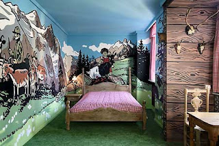
Murals are a tricky thing in the world of design. They can be a work of art, something to add interest and draw your eye...but sometimes they can draw your eye in a bad way. Here are some pictures and tips on when and how to use murals.
Residential:
When I first think of a mural, I think of a nursery or kid's room. It's very common for someone to pick out a theme and carry it throughout the room, even the walls.
Kid's rooms can be a space to have fun with decorating, but one wall for a mural is enough, otherwise it becomes a little too overwhelming.
This is a very cool modern nursery. They chose one wall to do a large graphic, and kept the crib and chair modern and simple. Also, the light and airy colors help not to overwhelm you.
Another option to a wall mural is wall decals. There are many websites out there now that sell almost any image you can imagine. Here they chose to do a tree silhouette as a feature above the crib.
Another wall decal placed just as an accent in the room, it keeps it simple but sweet.
This is a fabric wall sticker from Love Mae. How sweet and simple above a little girl's bed!
Now moving on to the big kids...are these wall decals from Fathead not amazing?! I could see this used from a teenage boys bedroom, to a college dorm room, to a "man cave" or media room in a home.
This cityscape wall decal gives this space a classy modern vibe, I could see this in an very cool and modern hotel room.
This is a very cool mural that adds a bit of graphic art to this room. The rest of the room is clean and simple lines so it really makes the edgy mural pop.
Commercial:
Murals like this in a corporate space can come across as a bit cheesy and they just feel out of place. There are other ways to give someone the feeling of being surrounded by nature or remind them of somewhere else through photography, etc.
This is a wall mural Studio B Designs incorporated into the design at Ireland Carroll & Kelley, P.C. Law Firm here in Tyler.
The mural was opposite frosted glass doors that lead to the conference room.
So from the conference room we achieved this blend of colors coming through the frosted glass doors.
Exterior:
This is a great exterior mural that catches someone's eye as they pass by. It's fun and hip which gives you a feel of how this business will be on the inside.
This mural is on the exterior of a building & is by John Pugh, an amazing artist who can create eye-catching and realistic illusions.
Another amazing illusion.
And another exterior mural from John Pugh.
-Cassie


5 comments:
this one is a beneficial and worth-reading blog. It seems that you know exactly the right content to catch all reader's attention. keep it up. got a great blog here.
frosted glass doors
this is an excellent access of information. Keep posting qualitative content such as this one.
frosted glass doors
Thanks for providing such functional and practical info. these are all worth reading . Thanks for sharing. More post from your site!
etched glass
Cool how theme! love it.
frosted glass doors
You want your walls to be unique, so we offer a wide array of mural wallpaper designs. If you like art, we offer classic paintings by the Masters, custom canvas poster
Post a Comment